Visitors
This page displays data related to visitors
🪪 Information Cards
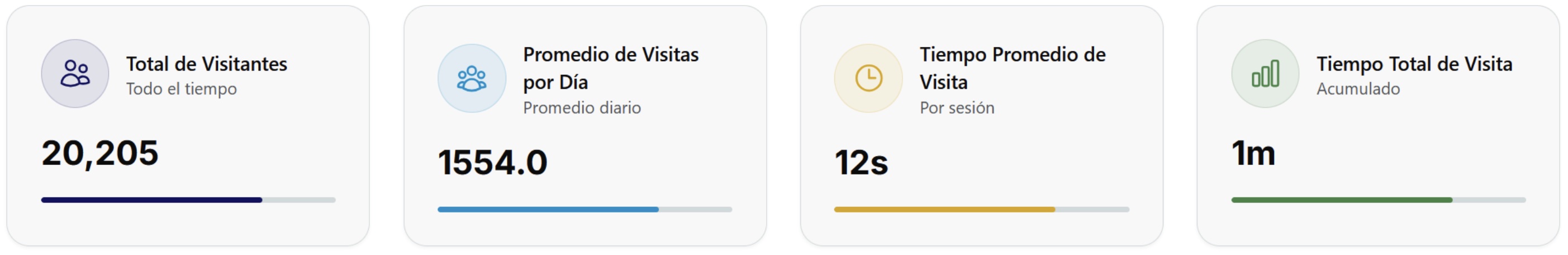
These cards show the summary of activities for the selected period.
👁️ Visitor Flow
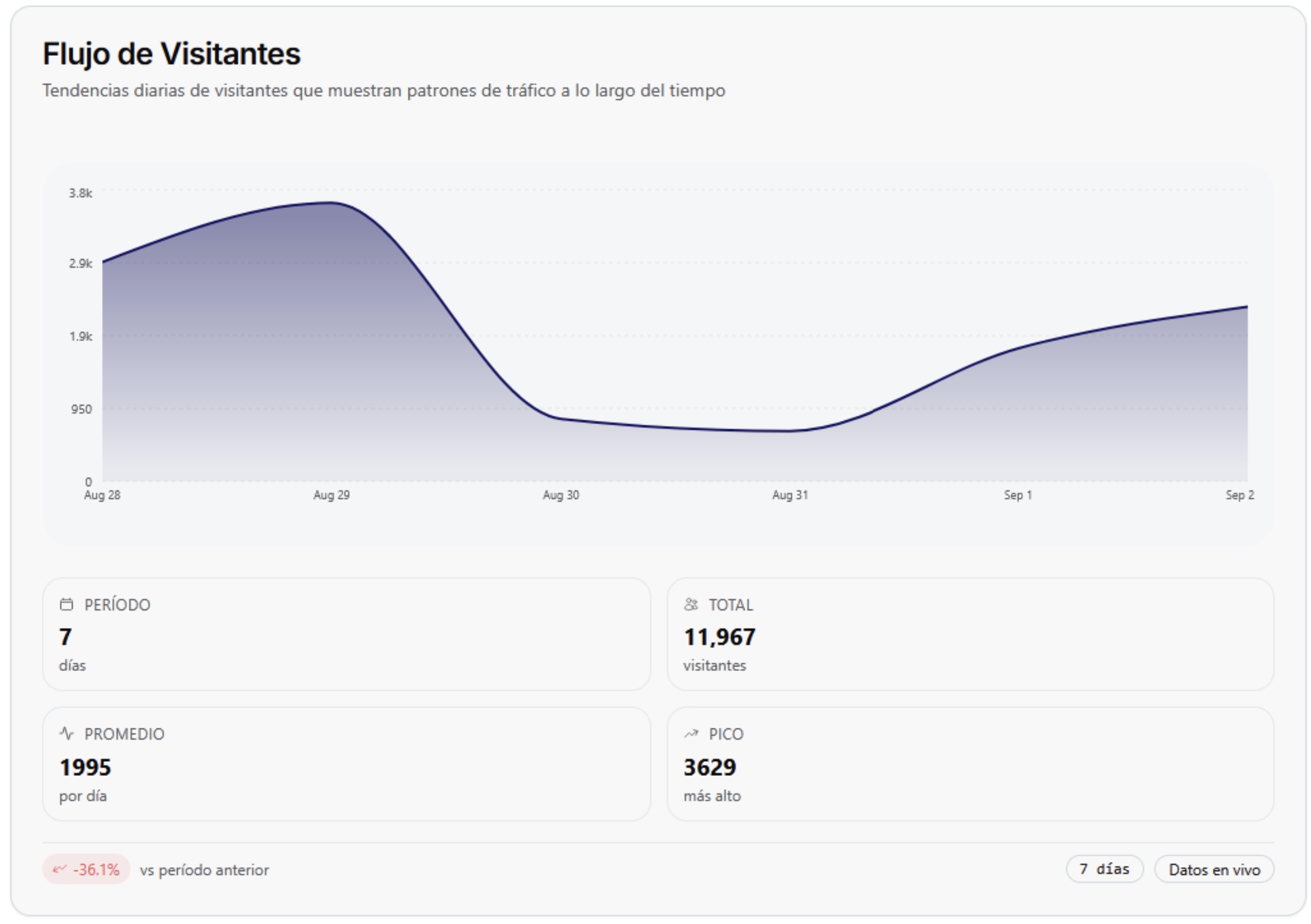
This graph shows the trend of visitors during the selected period, that is, the count of people corresponding to the selected dates.
Initially, this trend is shown graphically, while the summary of the data obtained from it is in the lower boxes. The period indicates the days selected in the calendar, in this example 7 days are displayed. Total refers to the number of people counted, that is, the visitors, which in this example is a total of 11,967 people. The next box refers to the average number of people detected per day, and finally, peak refers to the largest number of people registered in a single day.
In the lower-left corner, a dynamic percentage is displayed which changes by pointing up or down. This refers to whether the percentage is trending up or down in relation to the previously selected period. That is, if we select a 7-day period, this percentage would indicate an increase or decrease compared to the previous 7 days, and so on depending on the chosen period.
👁️🗨️ Visitor Interaction
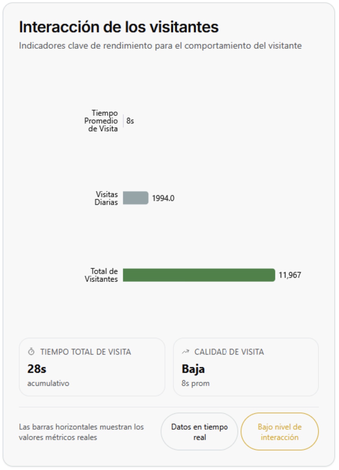
The graph presents a general overview of the visitors' interaction level. It reflects key indicators that allow evaluating both the volume of visits and the quality of the time that users remain active. Its purpose is to show if there is a balance between the number of people who access and the degree of engagement they manage to maintain during their visit. In general terms, this type of analysis helps to identify if the public's attention is being captured or if, on the contrary, it is necessary to work on strategies that increase retention and improve the user experience.
🧾 Comparison of Interaction Level
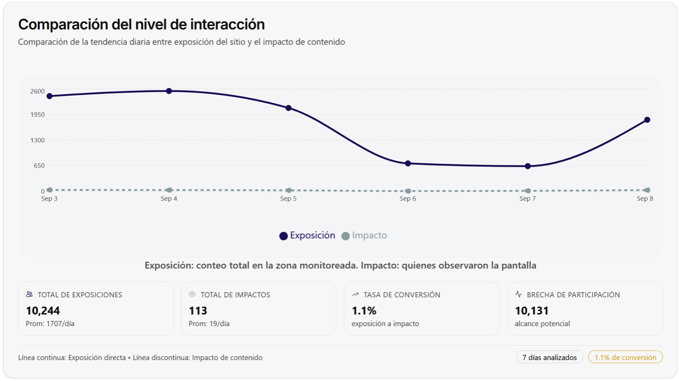
The graph shows the relationship between the visibility of the content and the actual level of interaction it manages to generate. It contrasts the number of people counted in the monitoring area (exposure) with those who actually show interest (impact), which allows identifying the existing gap between potential reach and real impact. This type of visualization is useful for understanding the extent to which exposure translates into genuine attention and for evaluating the effectiveness of the communication or exhibition strategies implemented.