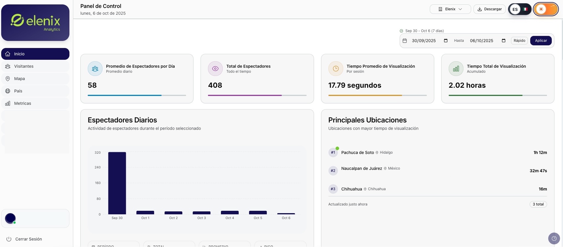
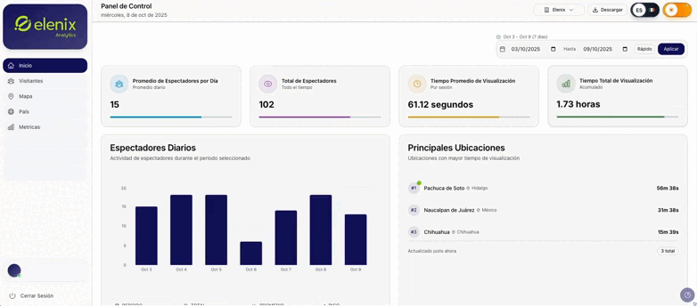
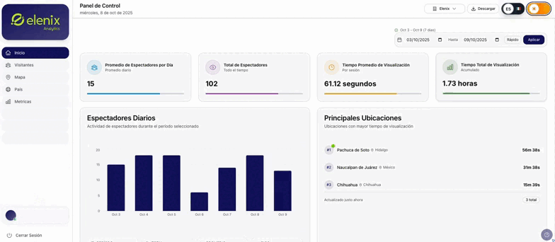
Home Screen
On the home screen, data for the viewers obtained from all active devices is displayed. The charts shown throughout the page are generated from this information.
🎨 Interface Customization
Theme Selector
This switch changes the theme of the platform, the default theme is light, clicking it will change to dark.
Features:
-
✅ Light theme (default)
-
🌙 Dark theme
-
🔄 Instant change
Language Selector:
🌐 Multilingual: Elenix is available in English and Spanish, the latter being the default language. Clicking it will change to English, to return to the original language, click again. The language change can be done as many times as necessary.
📅 Calendar
Date Selector
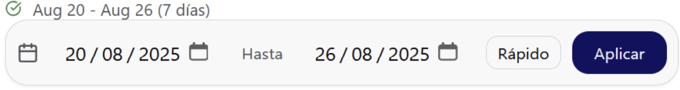
The calendar offers the possibility to choose a date range, showing only the data corresponding to the selected period. This tool is displayed throughout the different sections of the platform and its selection.
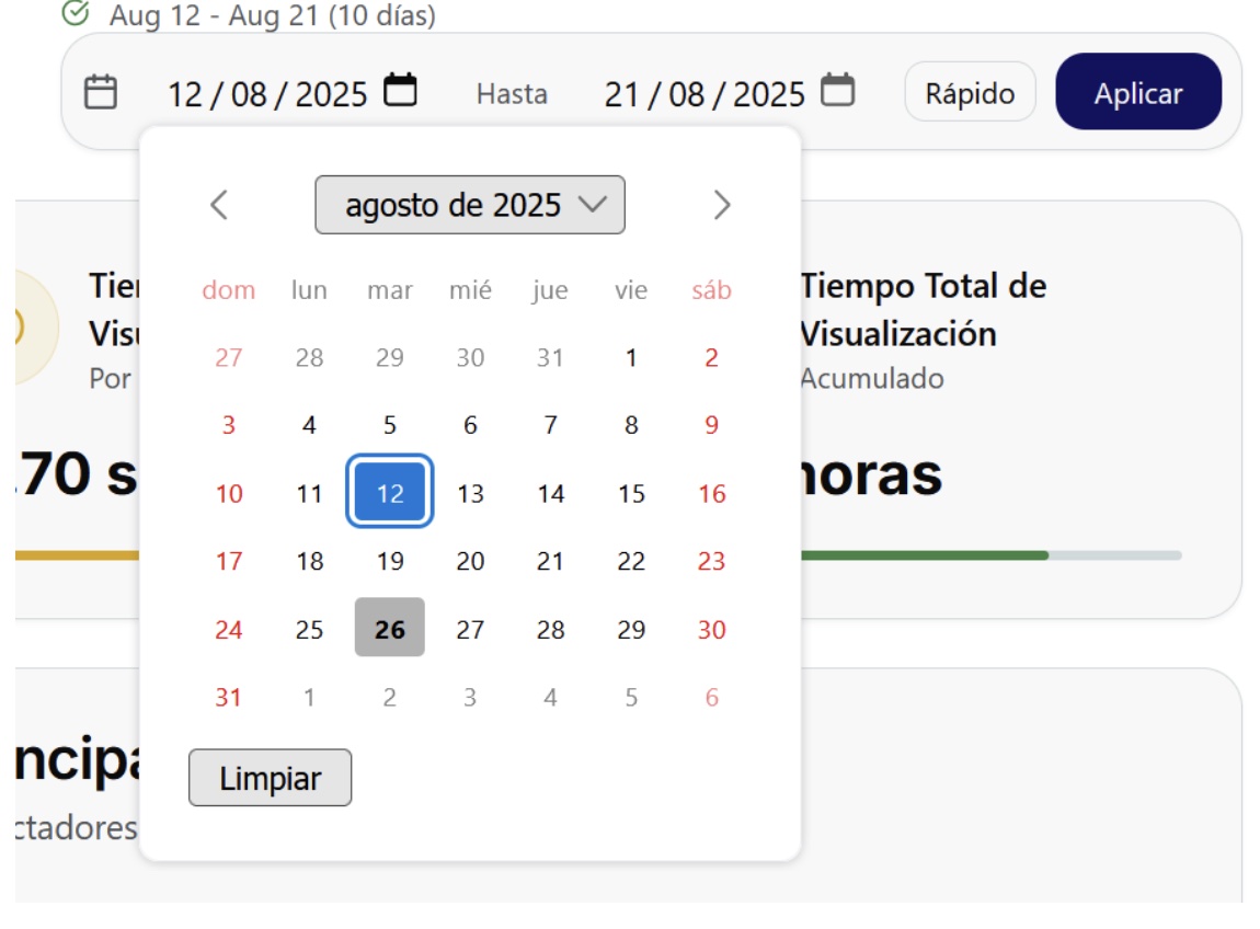
Clicking on the second icon will display a calendar to select the first desired range, for example, as shown in the image, the first date is August 12, 2025.
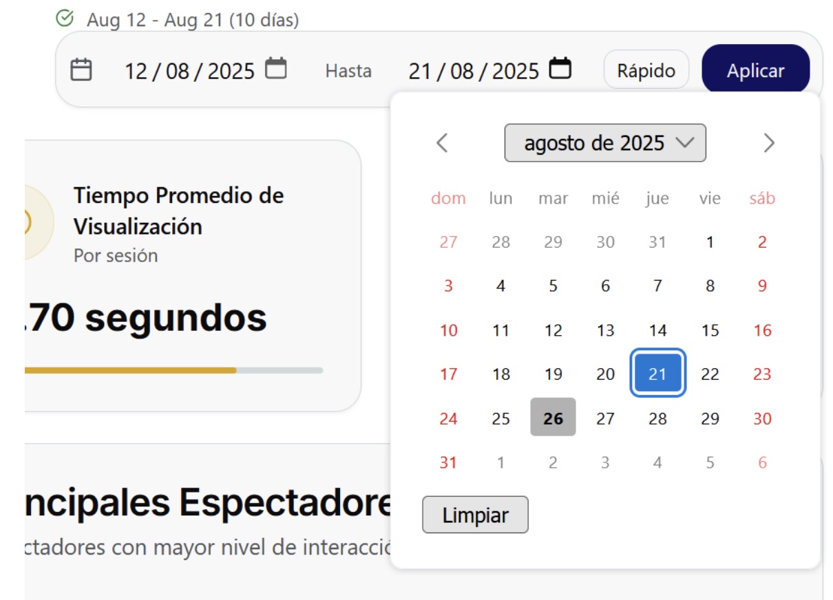
The third icon will indicate the second date, this means that the limit of the analysis is on this date, for example, as indicated in the image, it is August 21, 2025. Once the start and end ranges have been selected, click on "Apply" to save the changes.
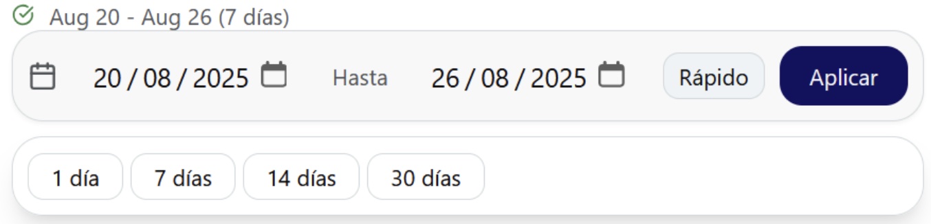
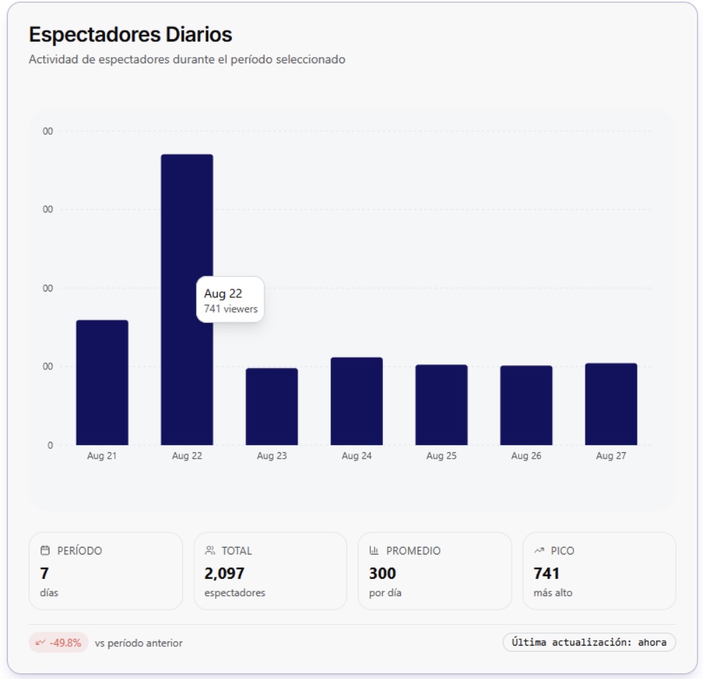
The "Quick" button allows you to select predetermined date ranges. Clicking on the selected range will apply it automatically. These predetermined ranges will always take the current date as the last day, for example, if we select "1 day" and we are on August 26, it is the day that will be shown in the analysis, but if we select "7 days" the range will be from August 20 to August 26, and so on.
📊 Metrics Panel
Information Cards
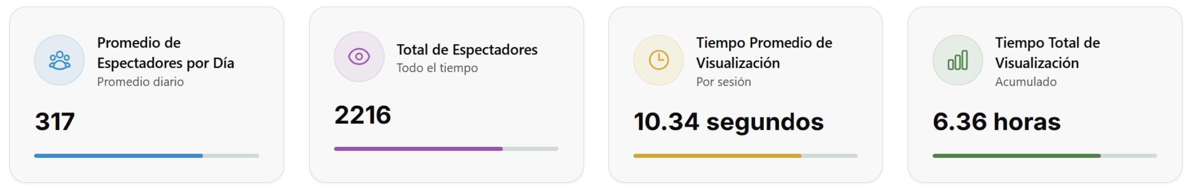
In this section you will find key and essential information about the image analysis obtained, as its name establishes, it indicates the data obtained from the analysis, these data are dynamic, since they respond according to the request of the selected date.
📈 Visual Data Analysis
Daily Viewers Chart
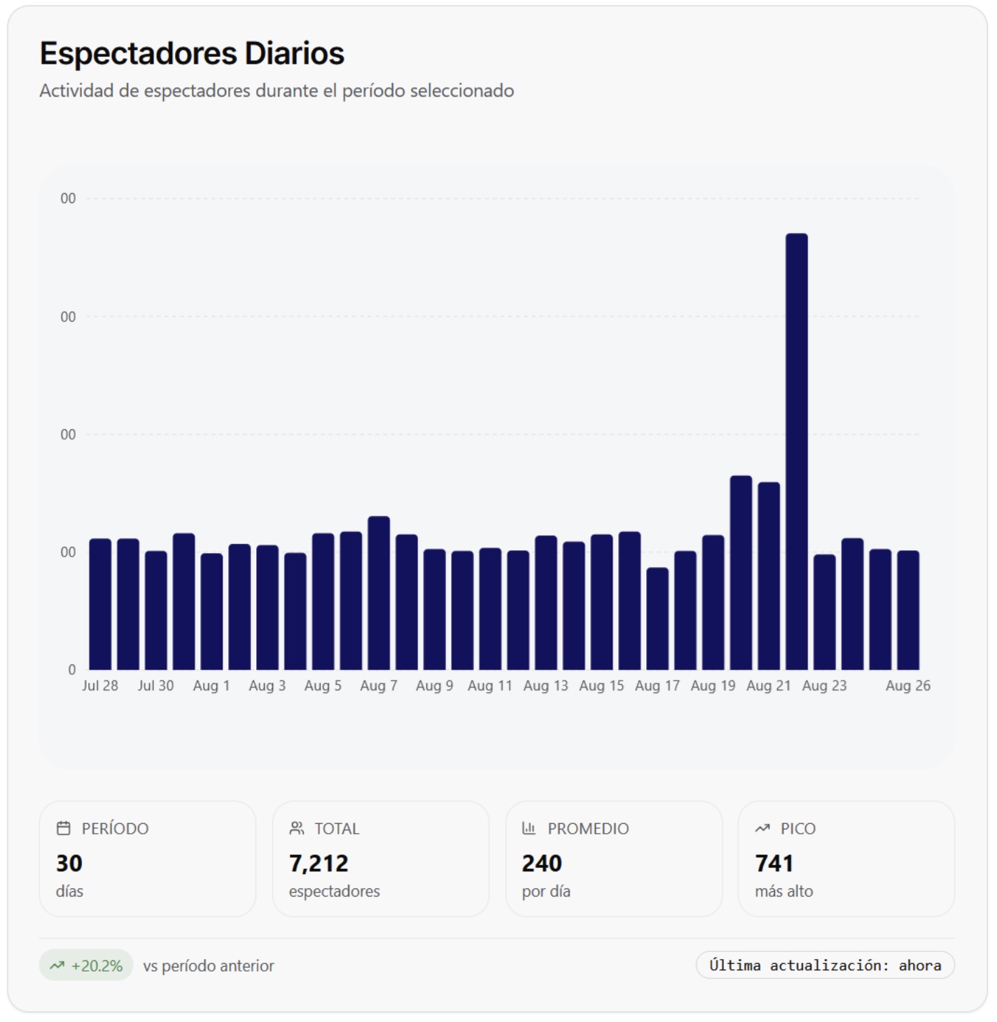
This graph visually represents the behavior of the viewers, also in the period selected by the calendar. The first box on the left indicates the period that has been selected, for this example it is a period of 30 days. The second box shows the total number of viewers we have had in that period, the graph represents that in 30 days we have had 7,212 viewers. The third box averages the number of viewers per day, this means that it divides the number of viewers in total by the number of days in the period (7,212/30=240.4) in case of obtaining numbers with decimals, the corresponding rounding will be done to show closed amounts. Finally, the fourth box shows the maximum number of viewers that was obtained in a day, in this example 741 are shown, therefore, we can conclude that on August 22 we had the highest number of viewers in the 30-day period, to know the indicated date, in case of not visualizing it at the bottom of the graph, passing the cursor over the highest bar will give us more information.
🌍 Geographic Analysis
Main locations
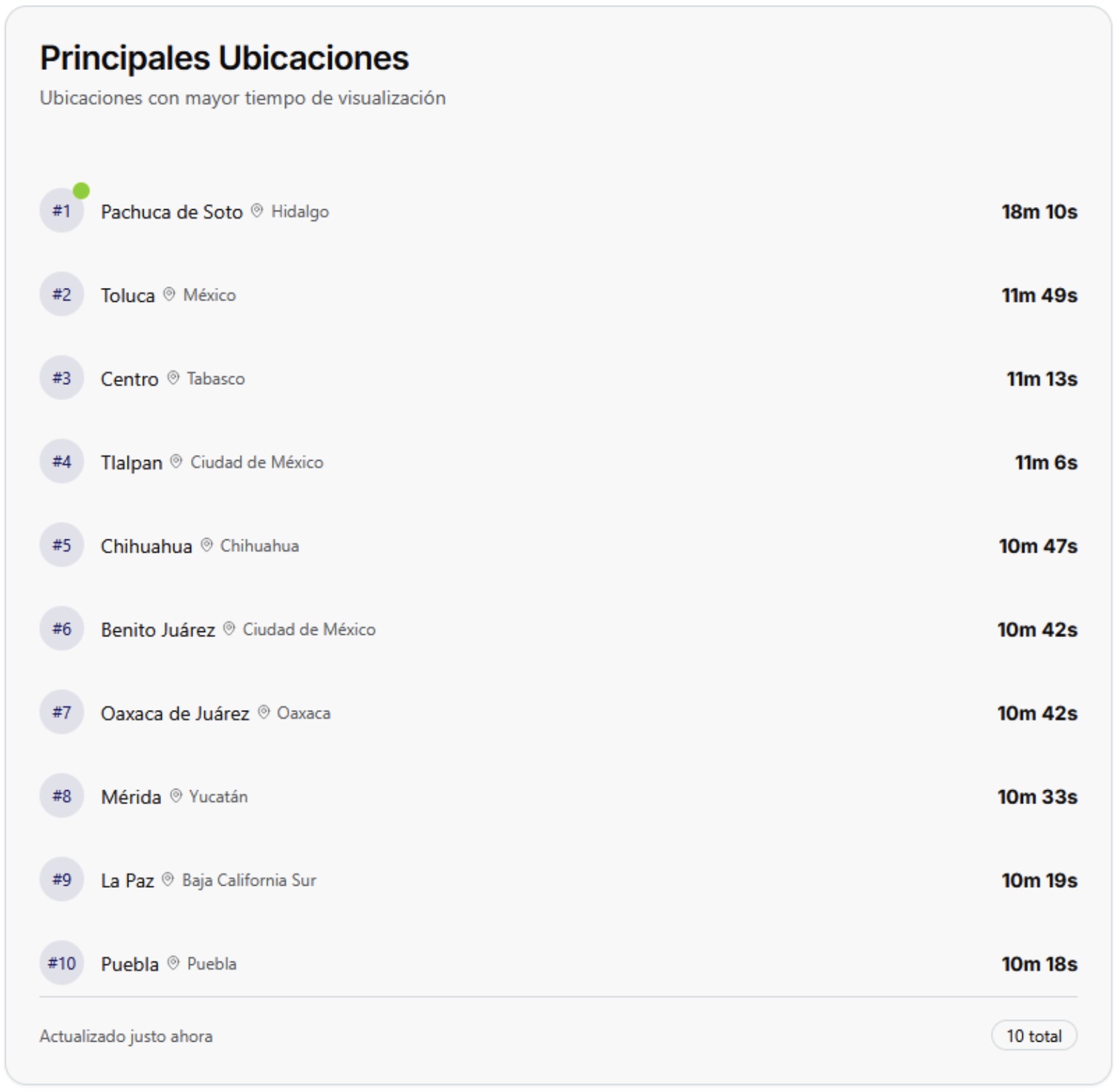
This table shows from highest to lowest, the 10 states with the highest viewing time and the time obtained from each one, if any.
Heat map by state
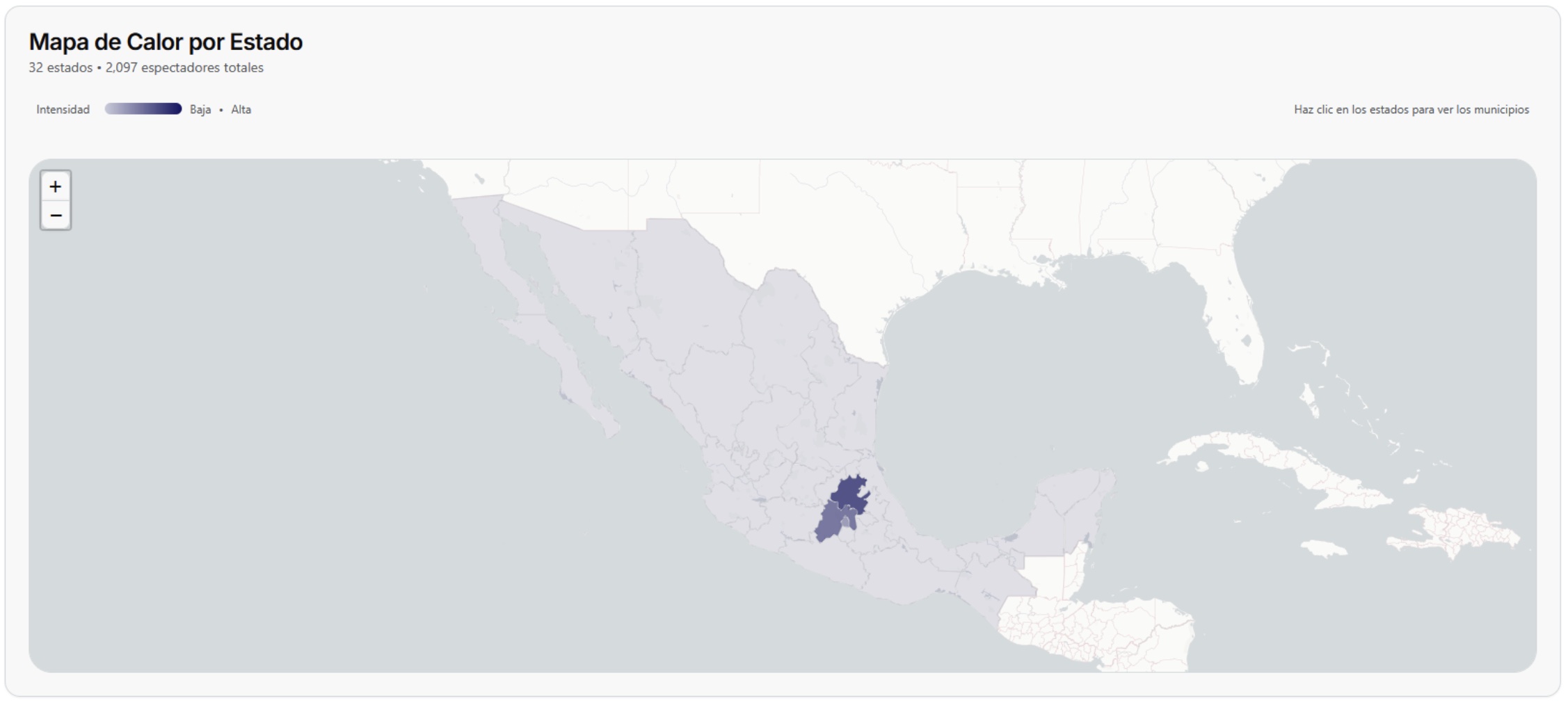
This interactive map shows by color intensity the information obtained from the viewers, that is, the state or states with the lowest number of viewers will be shown with a light color, while the states with more viewers will be shown in an intense color. Each state will show the summary of its activity by clicking directly on it. Once inside the information by state, the following information will be displayed:
Information summary
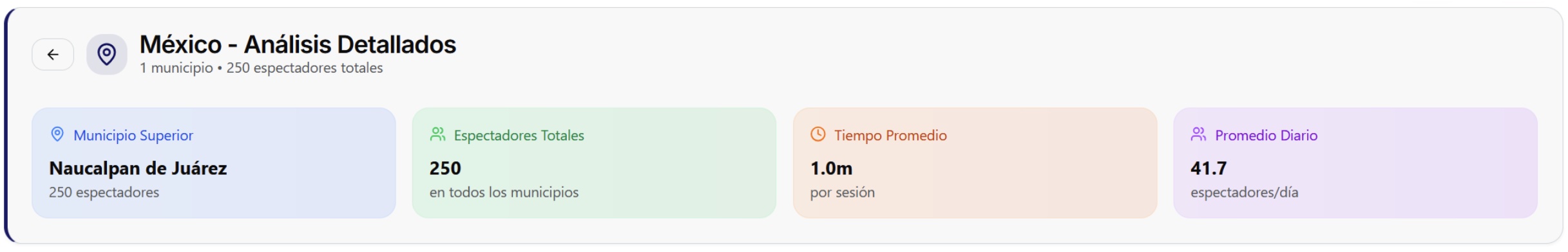
Just like on the home page, these cards show a summary of relevant information regarding the behavior of viewers and visitors throughout the state.
Viewers by municipality
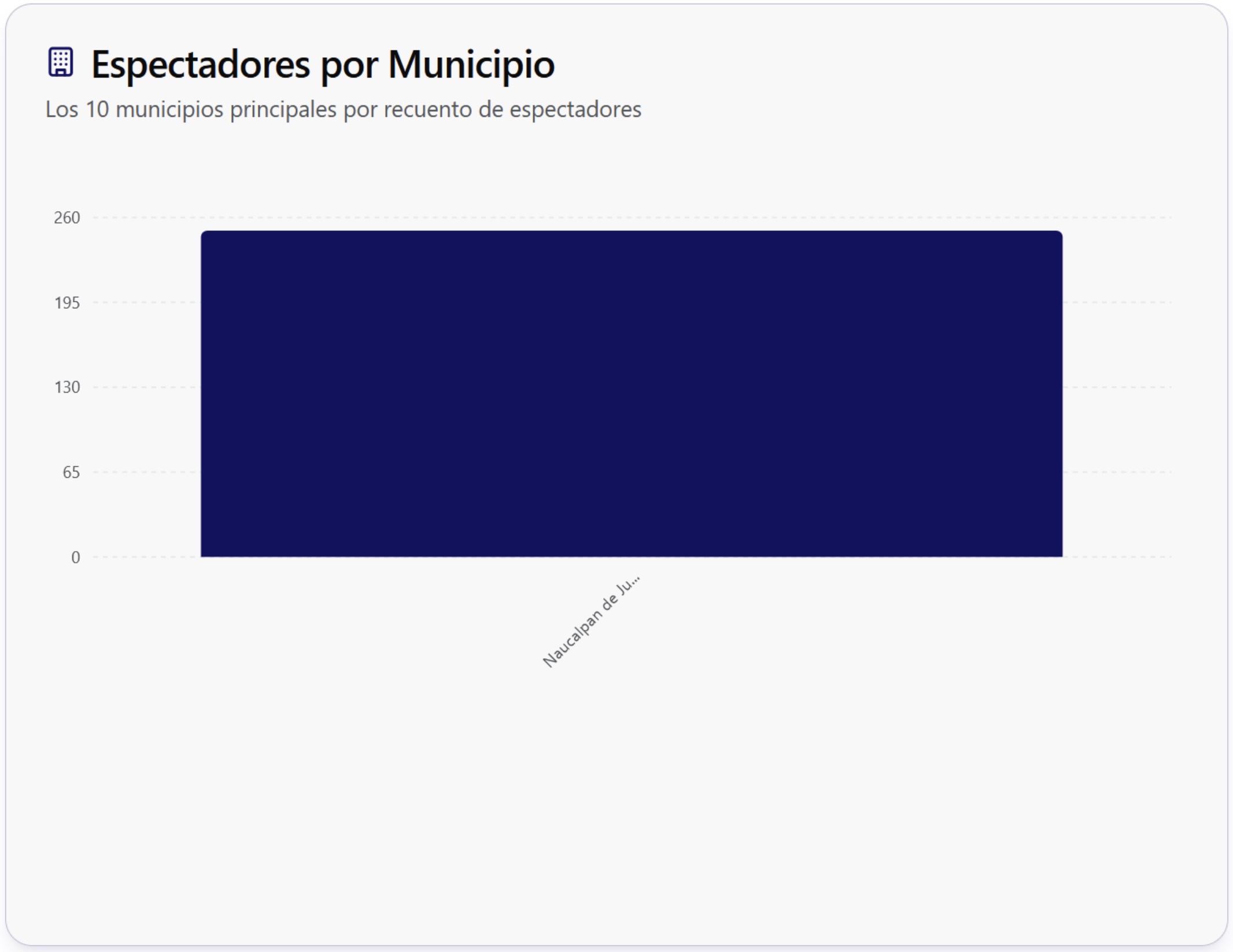
This bar graph shows the number of people who have watched the content in all locations of the state.
Distribution
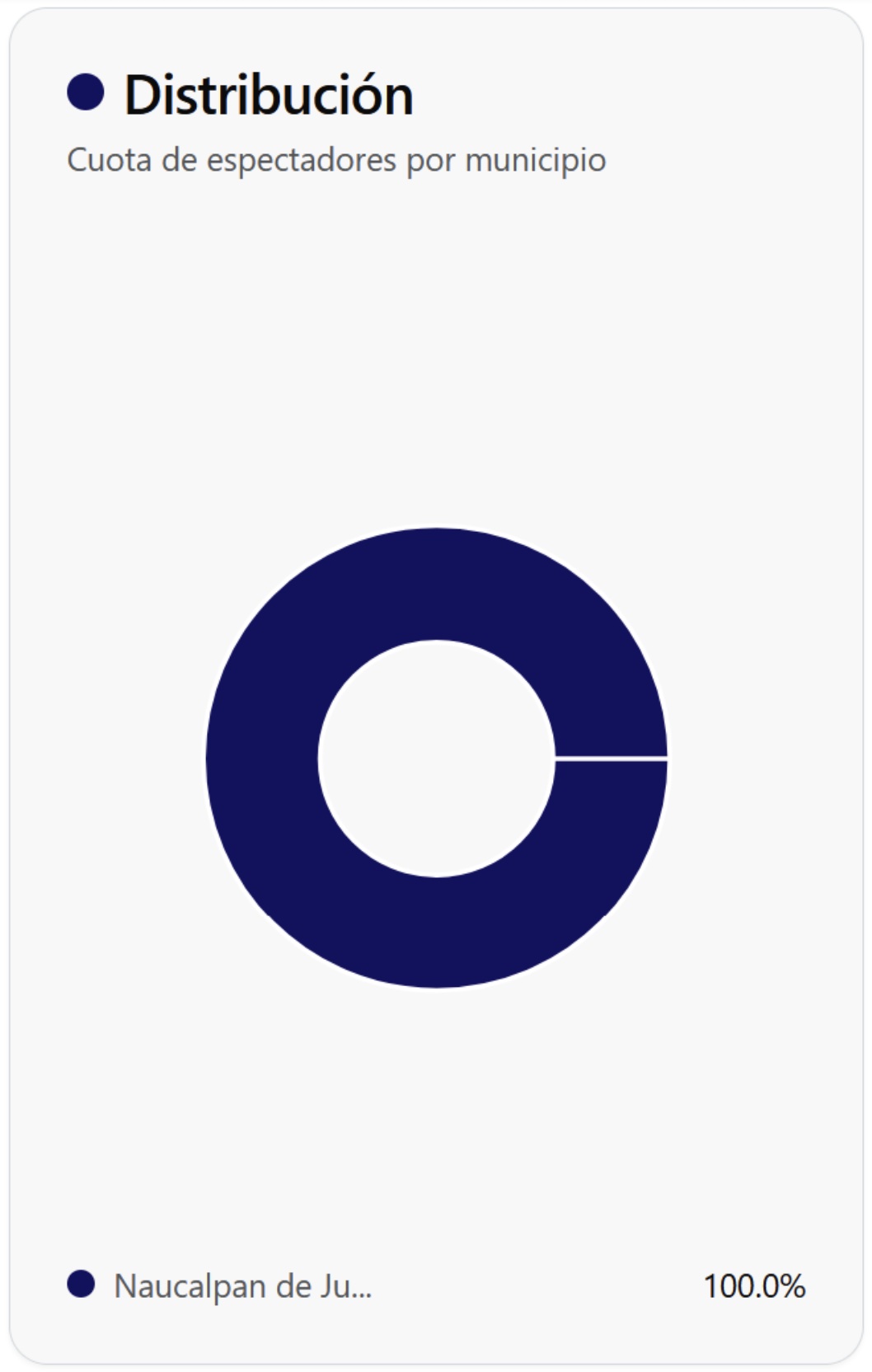
This graph shows the percentage corresponding to the viewers by municipality, for example, if we have 3 municipalities in the same state it will show with percentages the distribution of the viewers in each of them.
Location details
Click on any state on the map to access its detailed information and specific statistics.
In this section, all the locations corresponding to the state selected on the map will be displayed, including:
- Active locations by municipality
- Connected devices in real time
- Performance statistics by zone
- Activity history by location
Search and filter locations
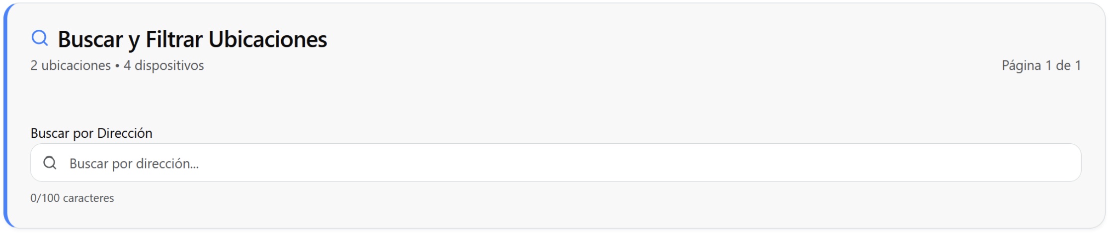
This search engine shows the number of locations and devices active in the state, it also allows you to search by address the desired location with a maximum of 100 characters.
Location details
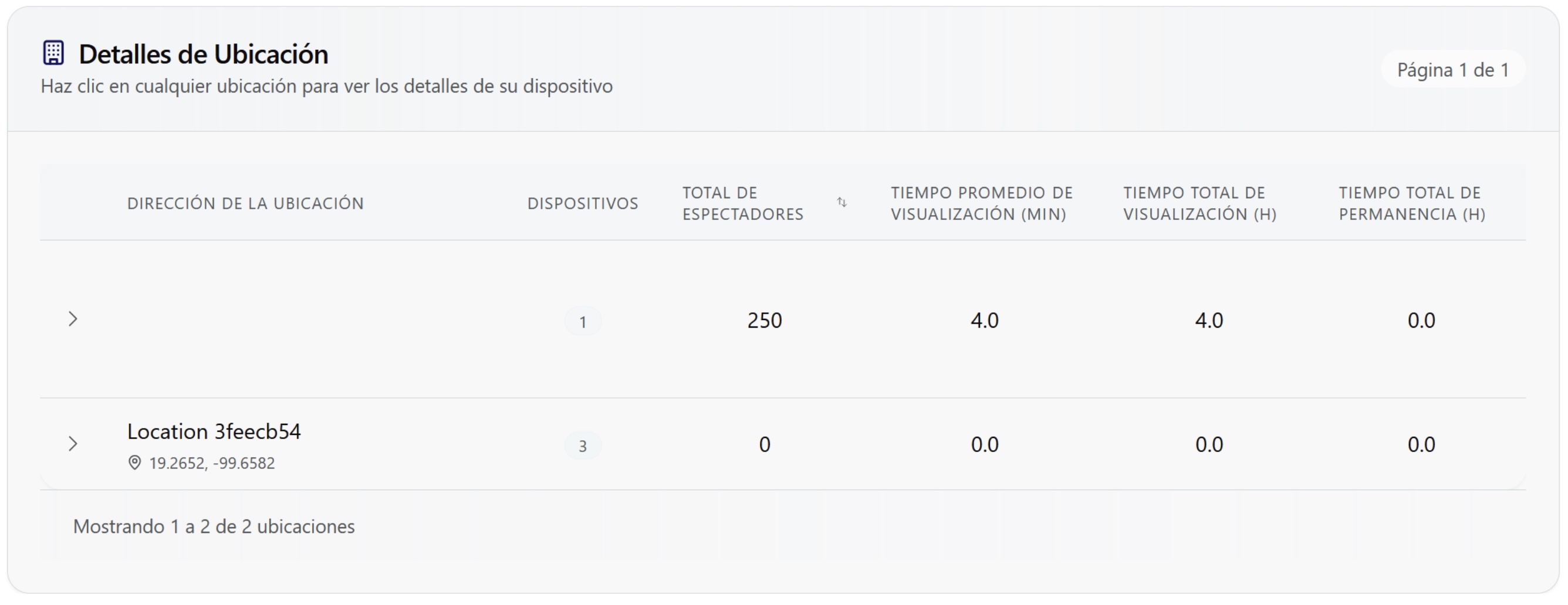
This table shows the details of each location, as well as the number of devices assigned to each of them. When searching in the upper section "Search and filter locations" the result will be displayed in this table. If you have the heat map analytics, it can be viewed from this section.
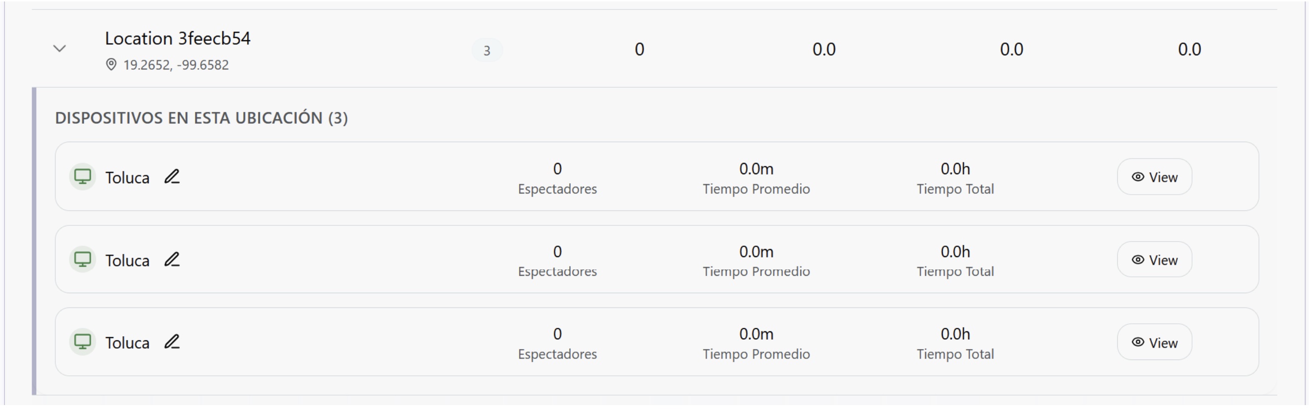
The "view" button will take you directly to the devices suitable for extracting this information.
To access the detailed heat map, make sure you have the necessary permissions and that the device has this functionality enabled.
⏰ Temporal Analysis
Peak viewing hours
This graph shows by hour what is the highest influx of visitors.
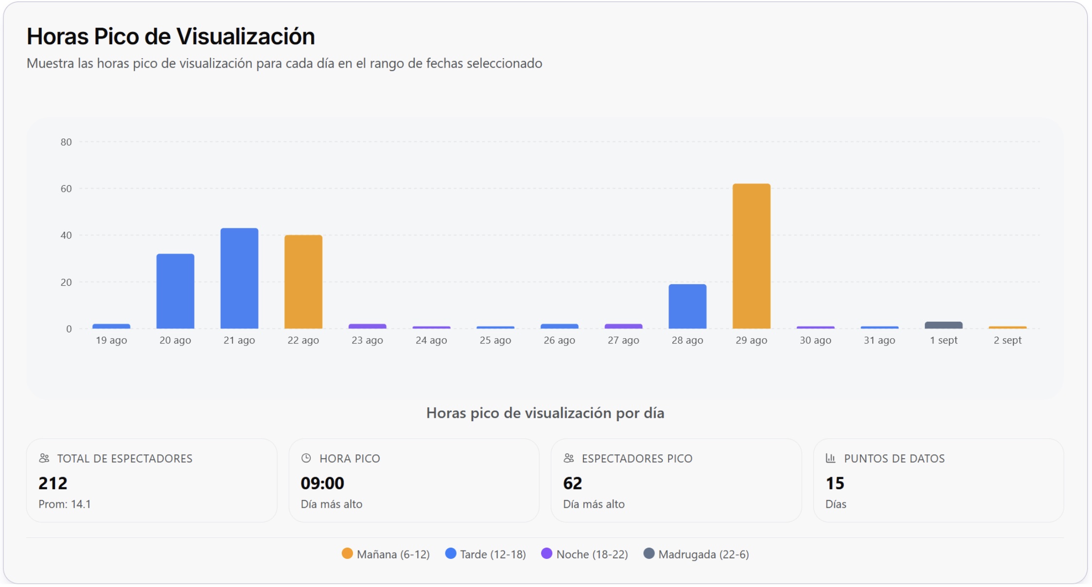
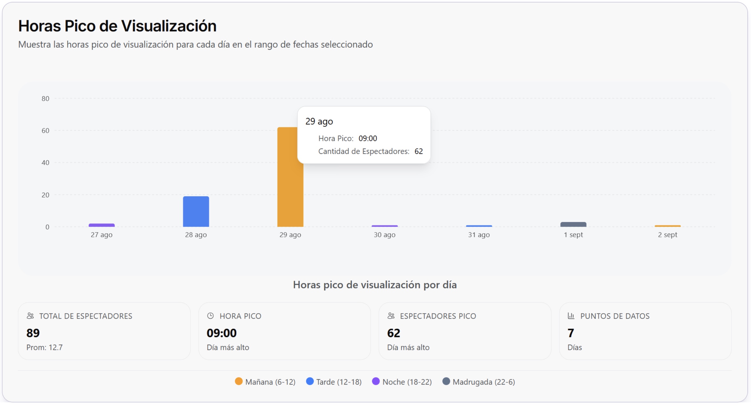
Putting the cursor over the bar of the desired day will show more information, for example, the day shown in the example (August 29) corresponds to the highest influx of the selected period, from this day of maximum influx the information is shown in the cards below the graph. From left to right, first the total number of viewers (of the selected period) is shown, in this case it is 7 days, then the peak hour is shown, this refers to the hour in which there was the highest influx on the most viewed day by the viewers, then it shows the highest number of viewers that there were at the moment with the highest influx, and finally "data points" refers to the number of days selected, these days correspond to the period chosen in the calendar, for this example, the calendar looks like this:
📖 Demographic Analysis
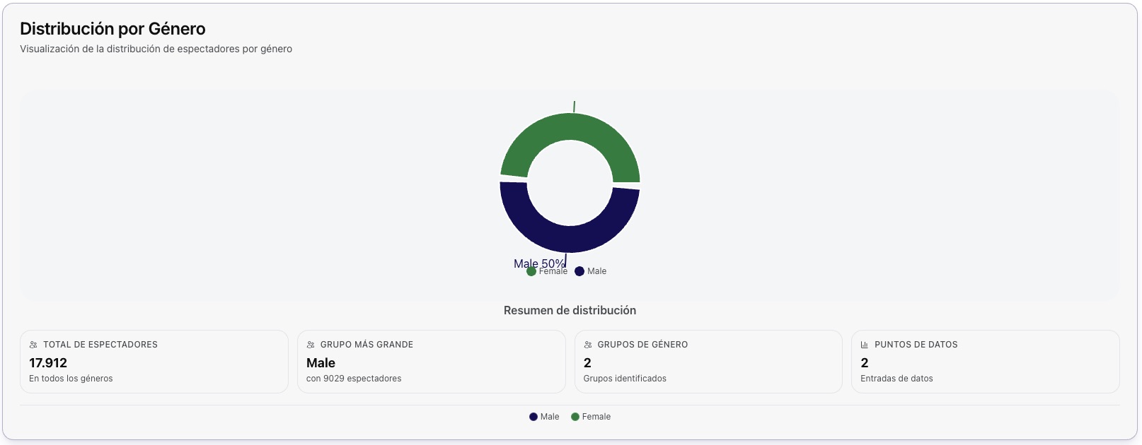
Distribution by Gender
The graph represents the percentage distribution of analytical data segmented by gender, allowing for a comparative visualization of the participation proportion of each category within the analyzed set.
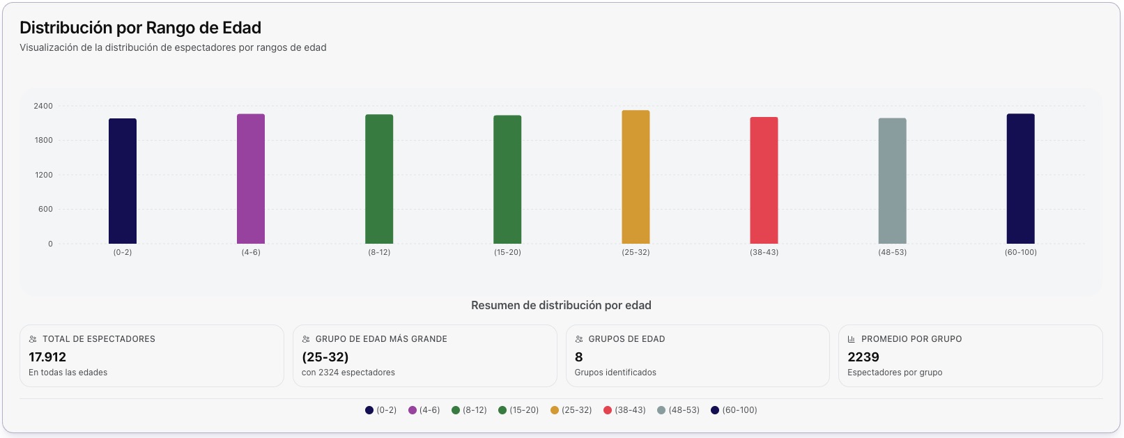
Distribution by Age Range
The graph shows the segmentation of information according to age ranges, representing the percentage corresponding to each group. This visualization allows for the identification of trends and comparisons between different age intervals.
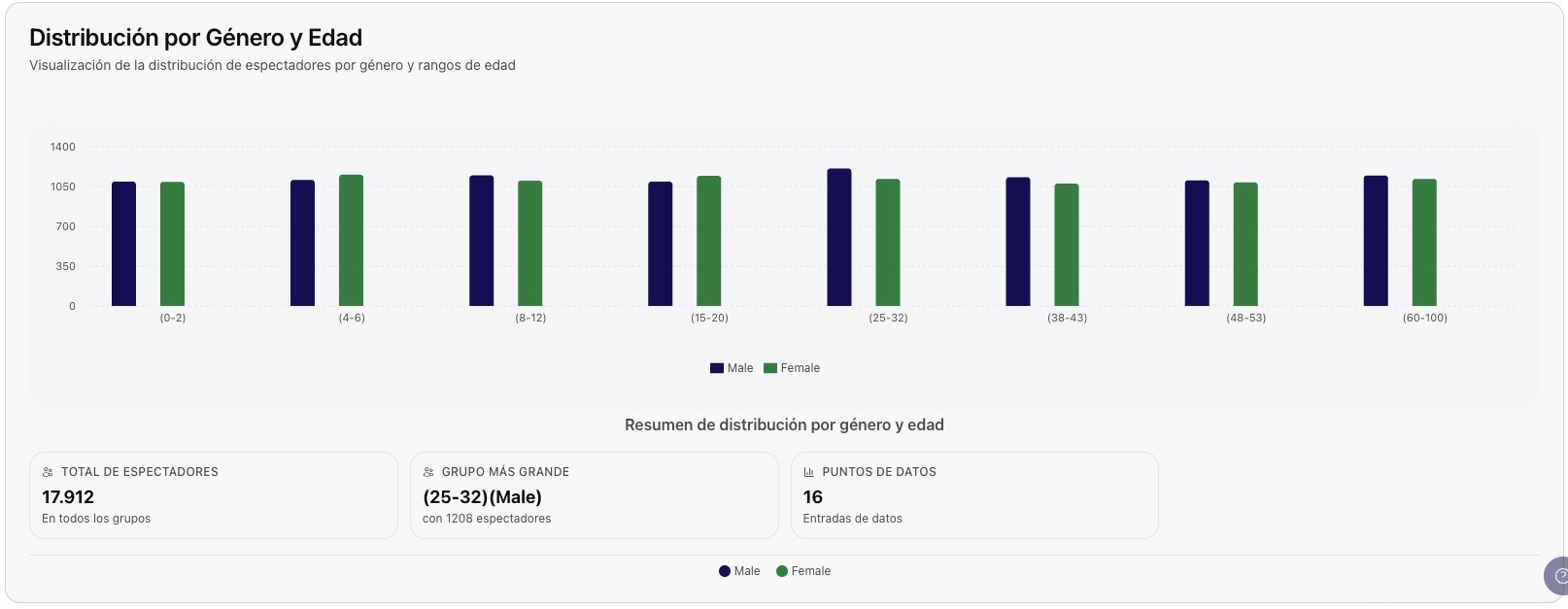
Distribution by Gender and Age
The graph presents the distribution of data by age ranges, further differentiated by gender. Each range is represented by two adjacent columns in different colors, allowing for a visual comparison of the proportion between men and women within each age interval.
Help
In the lower right corner, you will find the help button. This button is directly linked to the documentation page, which contains relevant information about the use and characteristics of the platform.
📋 Functionality Summary
🎨 Personalization
Switch between light and dark themes, and select your preferred language (Spanish/English).
📅 Temporal Filtering
Select custom date ranges or use predefined quick filters for specific analysis.
📊 Dynamic Metrics
Informative cards that are updated according to the selected period and interactive charts of viewers.
🗺️ Interactive Maps
Heat map by states with click-through navigation and detailed analysis by location.
📍 Location Management
Search and filter locations with device details and access to the heat map.
📈 Analysis by Municipality
Bar graphs and percentage distribution of viewers by municipality within each state.
⏰ Temporal Patterns
Identification of peak hours and analysis of viewer behavior for specific periods.
🔍 Intuitive Navigation
Interactive interface with informative tooltips and direct access to devices from the location table.
Ready to explore more features? Continue exploring the other sections of the documentation.